Showing posts with label photography. Show all posts

03 November 2010

{DFW Photographer} New!

custom packaging

Christina Lee would like to introduce her new custom packaging! :) Who does not like to receive products wrapped up all pretty and arranged nicely?  I know whenever I make a purchase---particularly at a clothing store, I like it much more whenever the bag is of higher quality---like those nice paper sacks with the handles, or even if my clothing items are wrapped in tissue paper.  It isn’t necessary, but it makes the experience that much more special.

Here’s a preview of our new packaging:

custom packaging

I know Peacock isn’t exactly a popular color, but I love it, especially with the damask and black and white.  I find it to be sophisticated, yet fun, and that’s the reason I chose that color, because I want my photography to be exactly that---balanced—sophisticated and exciting at the same time.

Custom Packaging

20 January 2010

Proximity and other Graphic Stuff

I don't know why I am still up.  Perhaps the Chicken Alfredo that Cliff talked me into getting at Olive Garden tonight has not settled in my stomach, especially after an intense ab workout at Zumba classes.  Ugh, either way I'm up and I can't help but think of the lesson I'll be attempting to go over with my students tomorrow.

Tomorrow we start discussing proximity and alignment. These are two of the design principles discussed by writer, Robin Williams.  Robin puts basic design principles into a memorable acrostic: "CRAP."  Yep, I said it, your designs need to look like CRAP!

Now, we have discussed design principles before at the beginning of the year based off the Digital Web Magazine, but I really like the way Robin Williams puts it, and the way she easily relates it to business through her examples with business cards, posters, ads, etc.  This is why we are going to discuss design principles according to Robin Williams--I want the students to relate this directly to business oriented design.  I want them to apply the principles to designing goods specifically for business.  I think it's important to know the difference between a good business card and one that totally stinks (typically one that sticks information in all four corners, which I'll post examples tomorrow.) I want the students to be able to design an ad or poster that makes it easy to read and really grabs the attention of the public.  I want my students to take something they can directly apply to the world of work once they leave my classroom.  (Afterall, that's the purpose of getting an education....right??)

So...in lieu of hoping to prepare these young minds with information to develop the skills to properly design promotional materials for the world of work, we'll begin to embark on this adventure while we finish up Fireworks by beginning on designing a business card.  After we design business cards (and hopefully print them out;) we'll move on to designing a promotional material such as a poster for their business and when we move on to flash, I want them to be able to design an interactive advertisement for the web in Flash. 

I know it sounds very strange but I really really love studying the principles of design and improving my design abilities and putting together things such as business cards and promotional items.  I'm not sure why, probably because it relates well with my organizational nature. 

However, here is some advise for you as you plan your graphic design adventures that my students should already know. (Because we've practically beaten this over and over in class.)

1. Don't use any more than 2-3 fonts on a design project. 
You don't want to clutter your project with a variety of fonts because then it will lack flow, and then the reader will stop reading, and the whole point of your project is so someone will read it.


2. Use decorative fonts sparingly.
Exactly as stated above. Use those decorative fonts sparingly!  Why?  Well Curlz is really cute and all but have you tried reading an entire paragraph written in it??  Your eyes get tired don't they?  So, my advise is to use the decorative font once---and not for a large body of text, more like a headline or sub headline and then the rest of the text should be in a clear, easy to read font such as "Times New Roman" or "Arial."

3. 1 Serif and 1 Sans Serif font please!
Here's my little vocabulary lesson for you: Serif means "feet" and Sans means "without" so, Sans Serif means "without feet."  A font with feet or "Serif" font example would be "Times New Roman."  A font without feet or "Sans Serif" font example would be "Arial."   Why is it important to use 1 and 1?  Well, if you use three different fonts that are Serif, then you won't be able to tell the difference between all of them as easily, and if you discern between the different fonts you will not be able to group important information together, which helps you better retain the information.


4. Dark fonts go with Light Backgrounds

Why you might ask??? Well, can you read lilac colored text very easily against a white background??  I cannot either.  That is why.  You don't want to strain your reader's eyes.  This is especially important with digital design because eyes already have to adjust to reading on a computer screen.

5. Light fonts go with Dark Backgrounds
Just like the reasoning for number 4, you want to see some contrast between your text and your background so the reader's eyes are not as easily strained.  Have you ever tried to read dark blue text on black background, (a choice that is a favorite among my students before they have come to grips with design reality.)  It's awful for your eyes!!!

Just using these simple guidelines in designing the promotional materials for your photography and the graphics you create such as holiday cards can make a difference in the appearance of your business.  It can take your promotional professionalism to a whole new level!  Try these guidelines out and see how your appearance might seem different.

Here are a couple of visual aids to help you keep in mind the next time you design a business card or promotional material for your business.

This business card is a BAD example of what your card should look like.  This card has no flow and pieces of information are randomly stuck in corners. You want your business card and promotional materials to have a definite flow, an order in which the reader will look over the card, and this has no order whatsoever.


This is a better example of what a business card should look like.  It uses the principles of proximity and alignment to create a card that has flow and defined order.  Proximity is the concept of grouping alike items together.  Notice how the name of the company and the representative's names are grouped together, and then all the contact information is grouped together further down the line.  Also notice, this card is lacking two very important pieces of contact information for this day and age.....an email address and a web address!  Those are almost more important than the phone number.  Especially if you are a photographer or graphic designer, a web site is a must! A web site is a way for you to display your work, it's your portfolio, so you most definitely want it available on your business card.

Also remember the rules about color, if you use too much, it will be too busy and distract from the core content of the card, your contact information and name.  It will take away from the flow.  So, decide on a color scheme, with about three colors and a fourth if it is used VERY sparingly---pref. that fourth color be a basic black or white.  There is really a strong statement you can make with only three colors on a card.

If you feel the need to suddenly re-design your business cards, consult this great blog entry at the Web Designer Depot which is titled; "100 (Really) Creative Business Cards."  These all make a statement and are sure to gain a spot in a wallet or purse whenever they are handed out.  They are all unique enough that people should feel like they are throwing away art if they dare toss it into the trash.

Also, while we are on the subject of typography, (the study of words, type, and letters,) here's another great blog entry from the Web Designer Depot regarding Typography Rules for every Designer---mostly aimed at Web pages, but also very applicable to designs in print as well. 

Well, I updated, added a few pictures, perhaps I'll add a few more examples throughout the weekend.
'Till Next Time!

18 January 2010

Ray's Pharmacy

Today is MLK day.  I'm doing my part of service by taking care of Cliff while he's recovering from the flu.  He seems to be feeling a little better today, still has some fever, but it seems to be going down.  Last night he didn't have to get up at all and he only slept with one blanket.  It seems things are getting back to normal. 

Well, we ventured out to get some Wendy's because that is what Cliff was craving for lunch, and on our way home we stopped by a local pharmacy that opened a new location on Broad street in Mansfield. 
The building has classic appeal and fits in nicely with a small town.  By my standards, it is super cute.  Cliff and I walked in the door and found ourselves in a pharmacy of traditional style--equipped with a gift section, pharmacy, and a soda fountain!  Near the front we managed to meet the man who started Ray's pharmacy in 1954, Mr. Lee Roy Ray.  In the back there is an old large oak cabinet with glass doors that lift up with a collection of Ray's memorabilia.  Mr. Ray shared memories about some of the items in the collection and the history of the pharmacy, including a prescription book that was opened to a prescription written for his future daughter in law when she was two years old.  We found out that Mr. Ray sold out to his son and now there are five Roy's Pharmacy locations in the area. 

I loved how small town and traditional feeling that the pharmacy still embraces.  It seems to pull off that feeling in a town that is booming with five high schools and has neighborhoods popping up all over the place.  The owners seem to have done things right, because the Soda Fountain was booming with lunch business, and as a result, others were roaming around the pharmacy as well. This pharmacy reminds me of the trips we used to take to Louis Morgan in Longview that has now blossomed into a gift store popular for local wedding registries as well as a pharmacy.  I really enjoy shopping at local businesses and supporting of my local community, and hopefully developing relationships with store owners and having that friendly interaction, so I think Ray's Pharmacy will probably be getting some of our future business.  If you live in the Mansfield area, check them out!

17 January 2010

Who Needs Campbell's When You've Got Homemade Chicken Noodle Soup?

Well, Cliff is still under the weather with the flu.  His temperature fluctuates between normal, 100, and 103.4.  Cliff's appetite has not been quite what it is normally so I decided to make a good, soothing, homemade soup last night.
The last time I made this soup was back in the Christmas break of 2002 when my dad and I were stuck at home while my mom and sister were on a mission trip in Mexico with our church.  I was initially the sick one, then dad caught the sickness, so then I had to take care of us both.  I decided to try my hand at homemade Chicken Noodle and it came out pretty well. 

What can be more soothing than Chicken Noodle Soup?  Homemade for that matter, not the condensed kind from the can.  I'm talking really CHICKEN noodle soup, with hearty bits of chicken in them.  (Oh the dog was in heaven too! because she got a couple pieces of chicken and broth! Holly loved it.)

Well, I decided to go all Pioneer Woman style and attempt to take pictures through the process of making my soup, in the event it came out pretty good and I wanted to share the recipe.  The pictures are no where near my normal quality, as I decided to not use a flash and I was working in my dark kitchen, but oh well, here 'ya go.


Homemade Chicken Noodle Soup
Ingredients:


-approx. 3 Chicken Breasts (I use Pilgrim's to support my hometown economy, but you can use whatever.)
-approx. 6-8 oz. of thin spaghetti
-1 can of chicken broth
-1 can of cream of chicken soup (okay, I guess you still need Campbell's)
-Salt
-Garlic Salt
-Mrs. Dash Table Blend (optional)

Here's the scene:

Boil your chicken in a pot.  Fill the soup pot, or in my case, my coated cast iron  pot where it just covers the chicken.  Boil your chicken until it is done, (the meat will all be white.)
-Pull your chicken out onto a cutting board (you'll slice it in a moment.)
In the meantime keep the heat going on your pot of water.
-Add to your water 1 can of chicken broth and 1 can of Cream of Chicken Soup.


You might have to whisk the Cream of Chicken in order to get it to distribute evenly throughout the broth.


Now, slice and cut up your chicken, which is best to do while it's still hot. 
 

Next, allow your broth to come to a boil and then add your spaghetti and allow it to cook until it gets soft.  I always do the utensil break test, I see if I can break the noodle with my utensil against the side of the pot to see if it is soft enough.


After you add your spaghetti, now is the time you take to add your garlic salt and Mrs. Dash (if desired) to your broth.


This stuff is my Grandma's secret ingredient I guess you could say.  She likes to use it instead of salt in her green beans.

After your spaghetti is done cooking, add your chicken back in by the spoonfuls, or drop in, just don't spash yourself with the boiling liquid.


Stir it all up real nice!
Doesn't that look YUM!?


Let the pot stew for about 10-15 minutes, you'll want to turn your heat down to about 2-3 at this point.


Finally, serve it up to your loved ones! I added baby carrots on the side because Cliff generally doesn't like things added to his Chicken Noodle Soup, ESPECIALLY celery, because he hates celery, but he likes carrots on the side.
This makes enough to feed at least a family of four, and there is enough left over to stick in the fridge for a re-heat if you are feeding just two. 

Hope you enjoy!  

11 January 2010

Hello Monday

Well, this year is off to quite a start.
We've had freezing weather last week and my best friend gave birth to her second child, a beautiful baby girl.  My best friend, Terrie, lives in Mount Pleasant, Texas and gave birth to her baby there on Monday.  The birth went very smoothly and I was so sad to not be able to be at the hospital when little Lexi was born.  Unfortunately, Lexi has some heart complications involving an aorta that will not open all the way, and had to be air lifted to Dallas on the same day as her birth.  Terrie, Richard, and her parents, brother and another family friend all drove as quickly as possible to Dallas to join little Lexi.  As it turns out, Lexi is probably going to have to stay in the hospital here in Dallas for about three more weeks after she has open heart surgery next week.  Last week was long, filled with visits to the hospital and scrambling to prepare meals that would travel well so Richard and Terrie wouldn't have to eat out for every meal.  Despite all the hardship last week, we still have a beautiful little girl to rejoyce her life in this world.  She is beautiful.  I can't wait until she gets to go home where I can take pictures of her without wires and tubes all connected to her.
Meanwhile, I was able to get some shots of this precious baby girl in the NICU this past weekend.
It was dark in the room, so I had to bump up my ISO super high which caused a lot fo noise.  However, I still got some shots.  Sometimes that's all that matters.

 
Lexi has a wonderful father who is so caring, and is willing to sing her back to sleep.


This father daughter relationship is already something super special.

Now, on to today's photo adventures, I braved bad lighting and super action and did a shoot for our school's drill team for the upcoming Spring Show 2010.  I'm so excited to be doing their shoot as well as the poster designs for this year's show!!!  I have a high respect for Sam Houston's Tex-Annes.  They are a great group of young ladies and they are highly dedicated to their performance.  They are definitely a positive example for the rest of our school.  Here's a preview from today's shoot:


Well, that's about it.  Hope you had a great monday!

04 January 2010

Shoot Sac Has Arrived!

I couldn't wait to get home today because my Shoot Sac came in!
I was so excited, that I opened the box in the office of the apartment complex and showed the girl who got the package out for me.
Here's what I saw when I opened the shippping box.

Such beautiful packaging isn't it?
 
I think I'm going to keep it and put my covers that I collect in it.
 
I LOVE green with black and white as well.
 
Fling cover! yay!
 
I like the people at Shoot Sac and their little "Thank You!" stickers. How nice!
 
My shoot sac with Fling cover and added shoulder pad.
 

Now, if I could just figure out what my husband had delivered today as well.

Do you know what it's like whenever you buy a wonderful new dress or amazing pair of new shoes that you are so excited about you wear it around your house for a couple of hours once you finally get it home?  Yeah, I've been walking around the house wearing my shoot sac. It is THAT cool!

02 January 2010

Monday is Going to be Bittersweet

There are two good things about the upcoming Monday and then there is one bad one.

I'll start with the bad and end with the good, because I like to leave you with happy thoughts.
1. School starts back on Monday.....which means I have to go back to work on Monday...boo.
However, the good thing about Monday is that I enjoy the job that I have. I like working with technology and the more I'm on my computer the more I learn about the programs I'm working with, which leads to expanding my knowledge in more than just my job. Now, if the kids are just not annoying and bothersome we will be fine.

Now on to the good. There are two REALLY good things and two other pretty good things going on Monday, January 4:
Really Good things go first:
1. My Shoot Sac that I ordered for my camera lenses comes in!!! I am so excited about this it's not even funny. I took some of my Christmas money and splurged and bought the shoot sac with a "Fling" cover. I can't wait to go out shooting with my good friend Sydni Rae with our shoot sacs and get a picture of them together so I can call it "A fling with a cowboy;" I can't help but think it's cute even though I know it's totally goofy. The idea comes from my shoot sac name being "Fling" and Sydni's being "Cowboy." Here's an example of what my shoot sac will look like:


2. My best friend will be induced for labor to give birth to her precious baby girl. I already know this little girl will be precious because first off, her name is going to be Lexi Jo, and second off, she is Terrie Smith's Autrey's daughter. Terrie already has her room set up and it is just dripping with girly cuteness with all the pink, brown, and green in the room and the fantastic custom bedding that Terrie's mom made. Terrie is fantastic at making anything cute and turning any house into a home and she's done the same with Lexi's room. This girl already has a bow holder full of bows. The really dreadful part about Terrie having Lexi on Monday is that I won't be able to be there. BOO.  I can't exactly take off work my first day back, believe me I'd love to though.  However, I will be making my way out to Mount Pleasant next weekend to officially meet Ms. Lexi Jo and of course, produce her first photo shoot for her and take tons of newborn baby shots. :) 

Now on to the pretty good things about Monday:
1. Zumba starts back up at the MAC.  I'll have to dish out some money for my annual dues to the MAC and for my monthly fees for Zumba, but it's totally worth it.  I finally found a way to work out that doesn't feel like total torture and I really enjoy it.  I love to dance and this allows me to dance my face off.  I also use Zumba to stay active and will hopefully help me in slimming down and reaching my weight loss/slim down goal.

2. Cliff and I start our 21 day body makeover/DIET.  This will suck and be pretty good at the same time.  It will suck because I have to give up some things I love to consume in my body, such as: sweet tea with caffene in it, white potatoes, red meat, etc.  However, it is a good thing because I know that this is doing something good for my body and it will help me cleanse my body of toxins and help me begin to loose the weight I need to.  The great thing is that Cliff will be doing this with me and I'm better at this sort of thing when I have motivation and an accountability partner.  I have already made some changes in my diet such as drinking more water and have cut WAY down on cokes, but other than that I've never really gone on a full out lifestyle change diet.  I need it, and I am looking forward to seeing my body slim down and back into a proper 24 year old's body.

Well, it's a pretty exciting Monday ahead of us.  I hope yours is just as exciting as well, that is, if you wish it to be.

01 January 2010

Fireworks 8 Tutorial: How to Run a Batch Process in Fireworks 8, (Resize a whole folder of images.)

After reading a tutorial in Digital Photography School of How to Batch Resize in Photoshop, I wondered if the same capabilities existed in Fireworks 8, and sure enough the capabilities are there, so I went through the process and decided to post it in a tutorial here.

I have always wondered how some bloggers, and more specifically, photographers seem to be able to resize so many pictures for the web without it taking FOREVER to do--which can make the blogging process, well, tedious and almost makes you want to not post pictures because the process can take too much time if you want to post several pictures.

In this tutorial, I'll map out the process on how to resize images for the web according to the dimensions I've pre-determined to fit into my frame I've created, you might want to specifically resize them for some other use.

Here it goes:

How To: Run a Batch Process in Fireworks 8 to resize a whole folder of images:
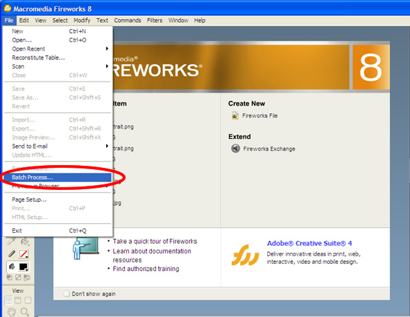
1. Go up to File, and select “Batch Process…”


2.       Go to your folder location(s) of your images to select the images and then click “Add” to add them to your files to be changed.  (You can select images from multiple folders, which I think is GREAT.)
Hint: I used shift+click to select all the files in one folder, or to pick a bulk of images in one folder.
3.       Once you have added your files, click the “Next” button.


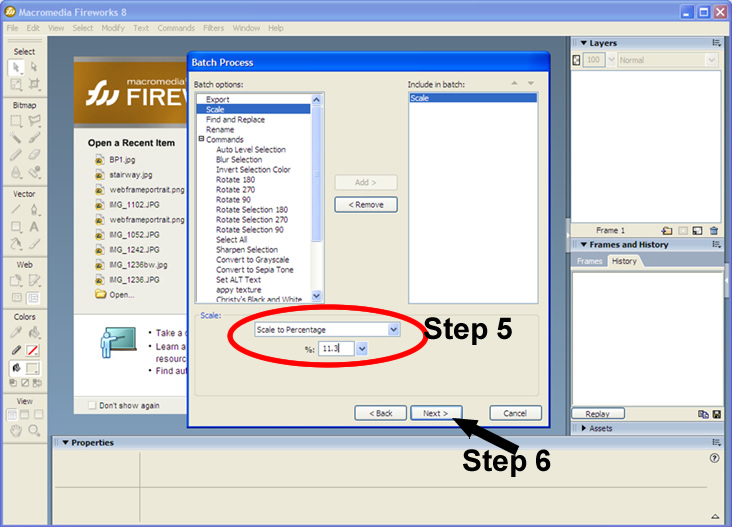
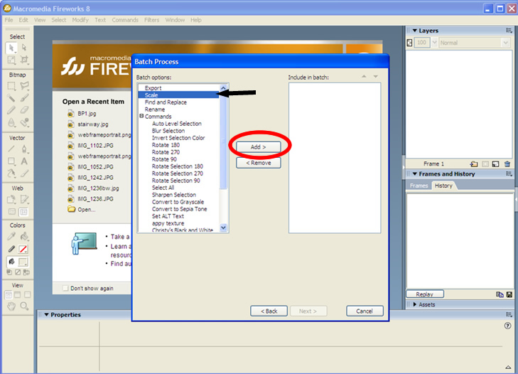
4.       From this you can select multiple functions to run and you can even choose from all of your commands you have either created or that pre-exist in Fireworks, such as “Grey-Scale.” In this case we want to just scale the pictures down, so select “Scale” and then “Add” to include it in the batch.


5.       Change your options at the bottom.  I want my images to be web ready, and I figured the happy percentage figure is 11.3%, so I am going to choose: “Scale to Percentage” and type in “11.3%.” 
6.       When you are finished, click “Next.”


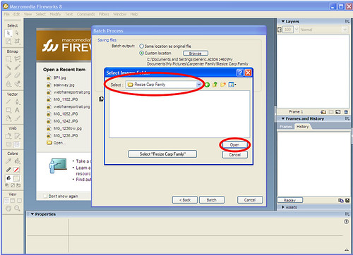
7.       Here you can select the location the files will be saved to.  Just to be absolutely safe, and because I am ultra organized, I always create a new file.  So, choose “Custom location” and click “Browse” to bring up your folders.  Make your way to your file location (you might have to go to “My Computer” first.) Double click on the folder itself as if you are going into the folder to select the whole folder.
8.       Click “open” to select the folder.


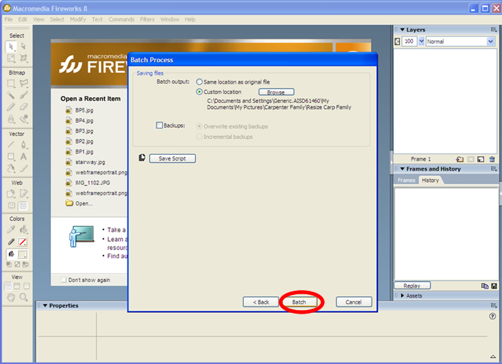
9.       Click “Batch” 


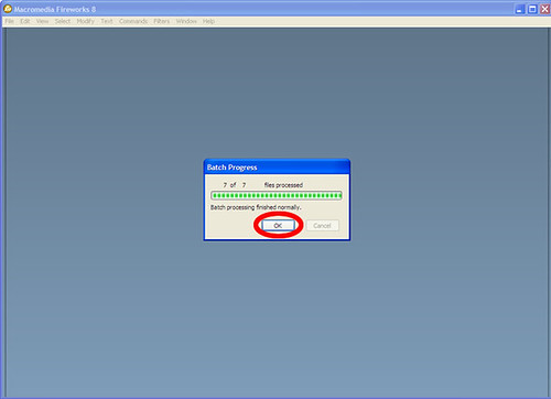
10. Your files will Batch and now you’re done!  When it is finished batching, just click “OK”


17 December 2009

Post Processing and Twiggy's Olay Ads Banned in England


As I was checking blogs and checking up on the latest news while on the Internet during my break at work today, I came across an interesting news story on the Fashion + Beauty blog through Yahoo’s website.  The blog boasted the title of its latest article: “Twiggy’s Photoshopped Olay Ads Banned in England.” What happened is Olay had hired the now 59 year old actress to pose for their advertisement of its Definity eye cream that is supposed to minimize the appearance of wrinkles and crow’s feet around the eyes. Twiggy’s appearance seems to be very youthful and close to perfect.  Well, the youthful appearance of her skin seemed to outrage members of the British population so much that it caused a stir in Parliament and now the British government has placed a ban on digitally altered images used in ads in order to prevent them from misleading the public.  People seemed to be praising the Parliament for taking action against what is essentially false advertisement. 
After reading this article, I can’t help but think of my photography in relation to this instance.  I love photography and I love working with the images in Photoshop or Fireworks, however I feel like as photographers, we need to be careful with how much we alter our images in editing programs.  Eventually, we might become more well known for our abilities to Photoshop rather than our abilities to produce a good photograph. 
This is one thing I want to focus on as a photographer; producing a spectacular image with my camera and my photography knowledge, not making my images spectacular with the use of image editing.  I think it is important to maintain my integrity as a photographer and remember to use it as a tool to enhance my photography, not take the place of good photography—otherwise I might be guilty of false advertisement in relation to the services I provide.  This is why I chose to go back and take classes over photography rather than try to continue to fight through it myself.  I want to produce the image right the first time and not have the mentality of “oh! I can just Photoshop it later!”
How do you feel about companies post processing their images to make the models appear to seem "perfect?"  How do you feel about post processed images?  Do you feel that some photographers overr process to cover up mistakes in their photography?